How and why I made the Passion-Attraction Model graphs
Time
I put a lot more time into making the graphs and writing the posts of the past week than usual — at least a couple full days just graphing before writing a word.
Why
Why did I put so much time in?
Not because I didn’t have lots to do.
Because people who saw early versions of the graphs told me it helped them better understand
- Their intimate relationships
- Their partners, and
- Themselves.
They also enjoyed reading the graphs — like their eyes opened wide and they looked like kids with new toys, like who would have expected something so science-and-math-like could help them understand their intimate relationships … and work!?!
My main reason for writing here is to increase self-awareness in ways that help people improve their lives significantly but they can’t find elsewhere. People told me these graphs did that.
If nearly all the first people I showed early hand-drawn graphs found value in them, I expected better-produced graphs with write-ups would help more.
My other reason to write is to enjoy myself and learn, which nerding out like this now and then does for me in my own special way. Fifteen years ago in graduate school making graphs was a major part of my work. I graph less now, but still enjoy creating an effective visual model. If I can use some math in the process, all the better.
Early history
I had mentally envisioned these graphs long before drawing them. Physicists train to think in visual plots of measurable quantities that vary with time. Thinking that way feels so natural it didn’t occur to me everyone didn’t think that way. Studying a subject full-time for nearly a decade will do that.
Then recently I hand-drew a few of the graphs to illustrate some of my thoughts about how passion and attraction grew and decayed. Points I had trouble communicating without the graphs suddenly seemed clear to people I showed them to, reminding us why we learn to graph functions to describe nature. They clarify our understanding of how things that depend on each other depend on each other.
Data
People keep asking me where I got my data. The graphs don’t use data. It would take a long time to generate enough data to make that many graphs (though the scientist in me knows someone could do it in principle). I’m not sure how I would get such data, but I presume from interviewing people over time.
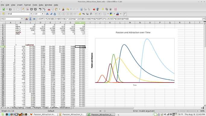
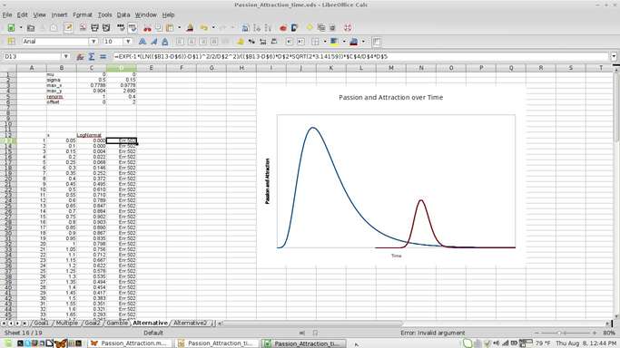
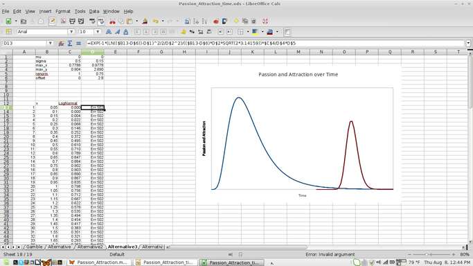
It’s a model. I made the plots from formulas.
Formula choice
How did I choose my formulas and parametrize the model?
I knew the general shape I wanted. As a physicist, my first idea for a curve I wanted was Planck’s Law for blackbody radiation with which Max Planck inadvertently proposed what many consider the first step of quantum mechanics — that energy comes in quantized bundles. That graph looks about like I wanted but is hard to work with, having a power of three and an exponential in a fraction.
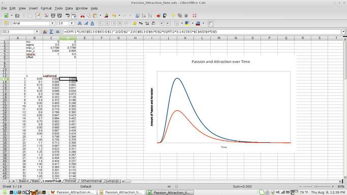
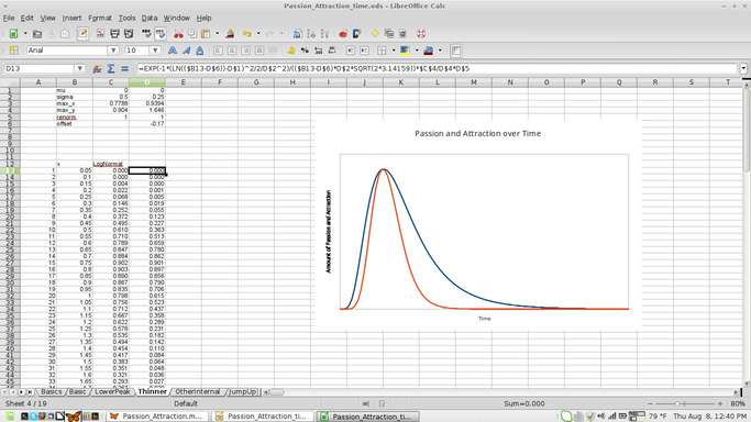
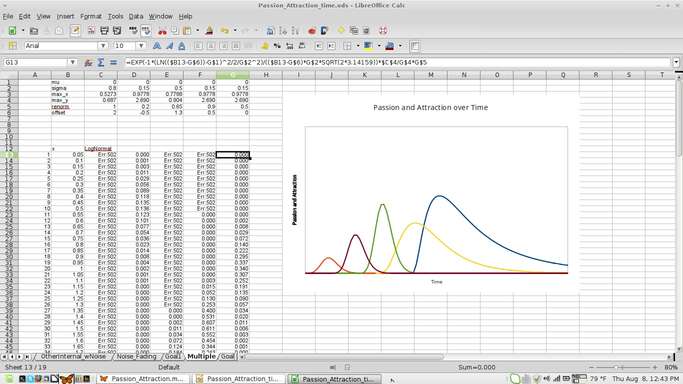
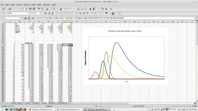
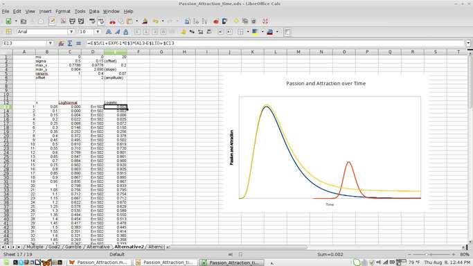
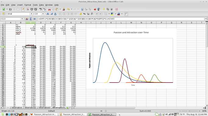
I looked around for other formulas and eventually decided on the formula for a log-normal distribution, which was close enough to a normal distribution to feel familiar and have documented properties and easy-to-use parameters.
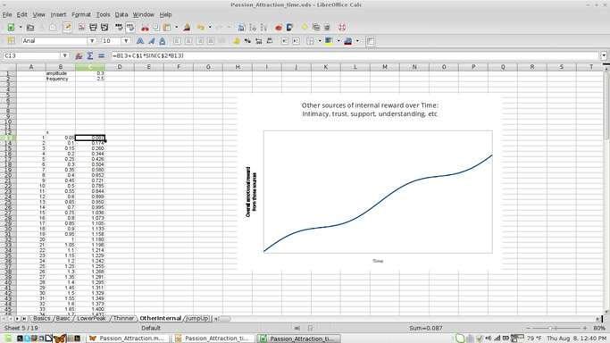
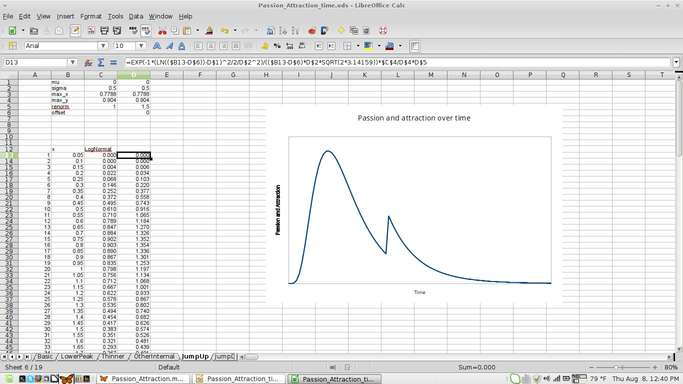
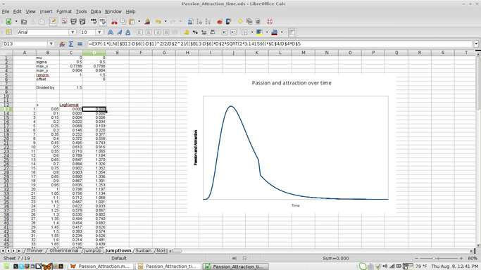
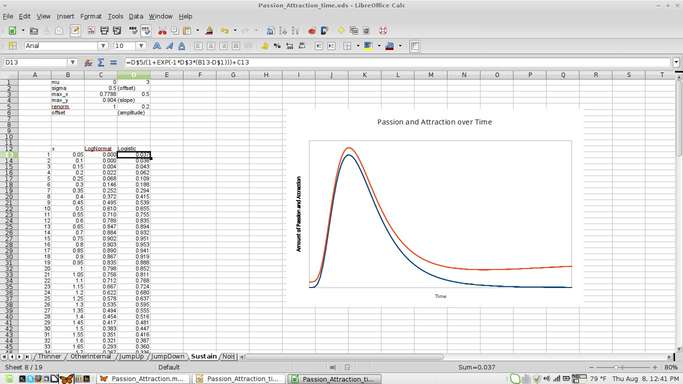
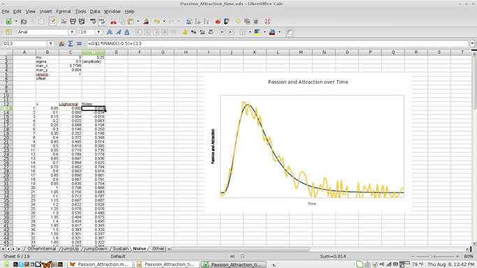
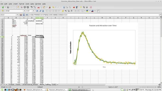
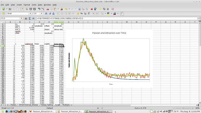
I made the tail by adding a logistic function to the log-normal function and added the noise by adding a random number.
Software
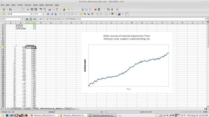
I made the graphs using the spreadsheet in LibreOffice, the Free Software office suite. Longtime readers know I avoid doing business with Microsoft or Apple and use almost exclusively Free Software on my computer, which I find superior in every way that matters to me over proprietary software, but that’s another blog post.
Here are screenshots of my work. You can use them to check my work if you want (please let me know about errors). I’d love to hear thoughts on it or for someone to extend the work.
blah
Read my weekly newsletter

On initiative, leadership, the environment, and burpees

Pingback: A visual model to understand passion and attraction: The Passion-Attraction Model - Joshua Spodek