Product review: Webinarninja embarrassed me in front of customers. One of the worst products I’ve used.
EDIT: I’ve started using Webinarjam, which has worked flawlessly so far. I recommend it instead. I haven’t compared it with others beside Webinarninja, which failed me miserably and whose customer support wasted my time, so I can say it works. It’s possible there are better alternatives, but I’m happy with it. To see my use of Webinarjam in action, check out my recurring webinar describing my leadership course, which as of January 2016 runs weekly on Thursdays. Click here to register and see it (you can unsubscribe after watching it).
I am pleased to promote products and services that deliver or overdeliver, such as a remarkably helpful flight attendant, my thirty-year-old-and-still-going-strong rice cooker / vegetable steamer / miracle appliance, and the pressure cooker that has improved cooking for me more than any other appliance.
Rarely am I so disappointed with a product or service that I feel responsible to warn others about it. Webinarninja is one example. They are one of the few companies I have stopped doing business with without an alternative in place. I’m improving my ability to give webinars and want to do more, but I’d rather do none than work with them.
I’ve hosted five webinars with their software. Each one suffered technical problems, design that made basic functionality impossible, and negligible follow-up from customer service.
I chose them because they appeared to provide the functionality I wanted and only that, plus the founder’s videos showed someone who cared. I believe they intended to create an effective product. For me, they failed.
After each problem, I sent the most helpful emails I could to understand what happened and to help them redesign and debug. I’m embarrassed now at the effort I put in to helping them, seeing how that time was wasted.
I wrote this piece at Inc.com that described what a horrible disaster their software’s bugs and poor design created. I could make the most of an embarrassing situation, but that doesn’t excuse that they marketed and sold something incomplete. And that they changed the design without documenting it. I held back on naming them there, giving them the benefit of the doubt that they might improve.
But I’ve held several webinars since then, the problems haven’t improved, and their customer service hasn’t admitted that their product would continue to embarrass me in front of customers, even when using the product exactly as designed.
Examples
- In the last webinar I hosted, the software showed my microphone as on, but attendees got no sound. Yet the automatic recording did have sound, so my settings must have been right.
- On my screen the webinar showed my slides full screen. The recording showed my slides taking half the screen. I don’t know what attendees saw.
- In past webinars, before the webinar started, the software broadcast sound from my computer to people on the waiting page, with no sign to me they could hear me.
- I can’t see both slides when projecting and the comments from attendees, so I can’t tell when questions arise.
- It turned my camera light on while it wasn’t recording. Given that the software consistently tells me the wrong thing that attendees see, I couldn’t be sure I wasn’t on camera when I didn’t want to be.
- It sent emails for the wrong webinar.
I could go on, but the number one job of webinar software is to deliver your message as intended. Webinarninja jumbled my message without warning. Attendees wrote back to tell me about problems with the software instead of asking about my product.
Correspondence
Here is an example of my emails trying to help them. Again, I’m embarrassed now at the time I spent helping a company that shows no sign of helping itself, but I don’t want people to think I’m just complaining. Here’s another example email trail.
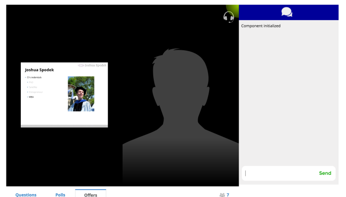
Here is screen shot of a webinar as an attendee saw it that the software showed on my screen as the slide taking up the full screen:

I didn’t want that shadowy figure on the right, nor did I know it was there. The software gave me no sign. I wanted just the slides, which the software erroneously showed.
More importantly, attendees wrote things like:
- The slide/camera display on the ‘ninja’screen setup is an unlucky layout. Get rid of the video space to enlarge the slides by at least 80%
- The slides were too small, way too small, nearly impossible to read.
In summary
As a human who feels compassion for people, I wish the best for the people behind this software.
As a businessman who believes in markets and competition helping deliver value to people with needs, I hope companies like Webinarninja that sell products full of bugs and design flaws but claim they are ready change or go bankrupt.
I recommend you not do business with them.
Read my weekly newsletter

On initiative, leadership, the environment, and burpees
36 responses on “Product review: Webinarninja embarrassed me in front of customers. One of the worst products I’ve used.”